Pop-ups can be annoying for consumers, but if delivered effectively, they are an essential part of any digital marketing strategy.
There is a perception that pop-ups are ineffective due to being intrusive, obstructive, and hampering to a browsing experience. They often block the section of text you are trying to read and sometimes cannot be easily closed.
However, these ineffective pop-ups are poorly executed: they don’t have the right message, design or functionality, and don’t meet the customer at the right stage. This is where conversion rate optimisation is key.
If you have any doubt in your mind that pop-ups should still be part of your marketing strategy in the 2020s, let this fact percolate in your mind; we have worked across clients that have seen lead generation uplifts of up to 1,000% with effective A/B/n and multivariate testing tactics.
Simply put, pop-ups should be a part of your CRO process.
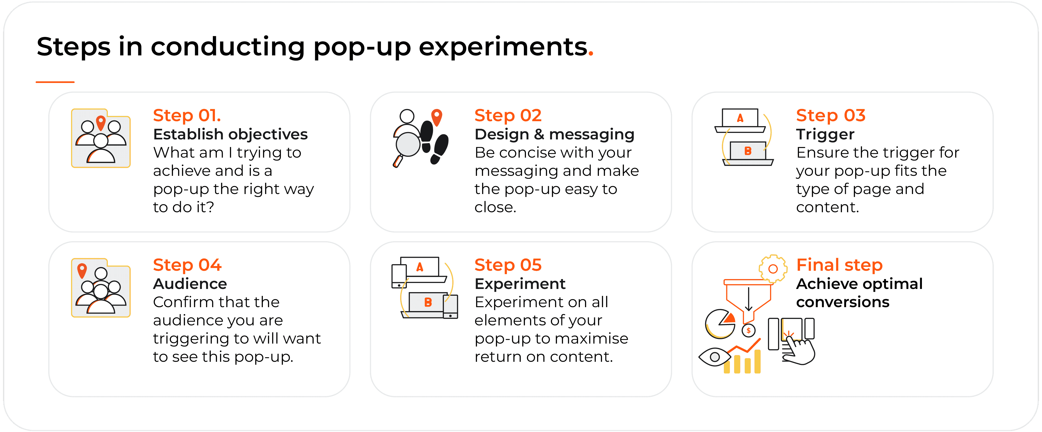
1. Establish your objectives
Let us start by stating the obvious; you do not need a pop-up for everything. In-fact, the first question you should be asking yourself is, “what value is this going to drive for my audience?” If the answer is very little, then you are likely creating a bad user experience.
Be strict on your objective whilst being critical of your website at the same time.
If you are creating a pop-up to drive into a certain sales funnel, then why isn’t your website able to fulfil that journey anyway? If you are aiming to improve your lead generation numbers, will your customer want to see a pop-up at this stage?
When we talk about bad pop-ups, we are talking about pop-ups that serve no purpose. Every pop-up should add value to the customer experience, rather than be an irrelevant distraction.

2. Design and message effectively
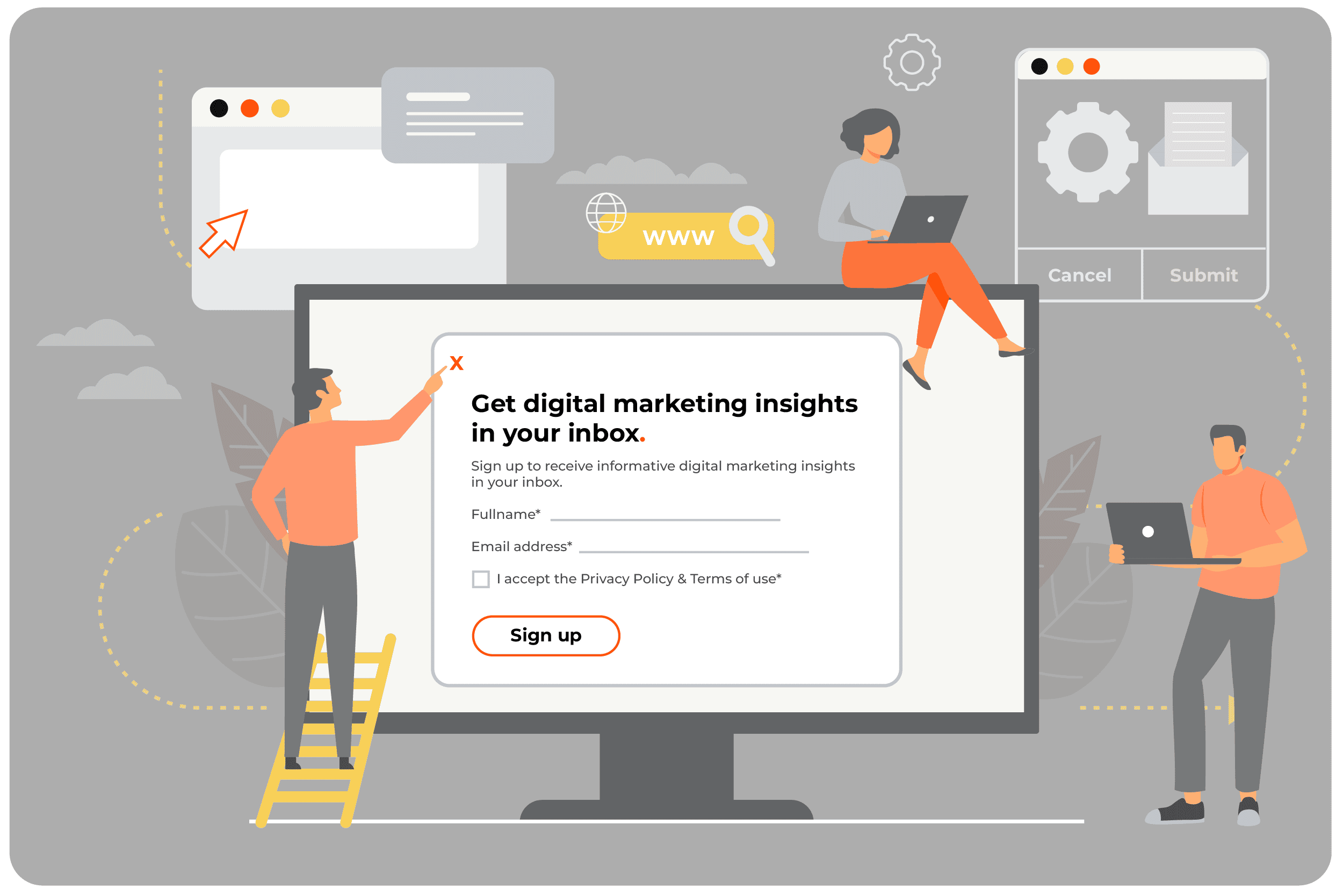
The average conversion rate for a pop-up is typically lower than 5%, meaning most of your audience will still dismiss them even if they are timely, relevant, and well-presented. You do not want to get in the way of those customers, so make it as easy as possible for them to close your pop-up quickly, especially on overlays that block other content. The letter X in the corner of the pop-up will suffice, as well as allowing the pop-up to close if the user clicks anywhere outside of it.
Having made it easy for the people who are not open to the idea of seeing your pop-ups, let us now focus on those who are. Do not rely on lots of text. Where you do use text, treat it as a headline. What is the shortest, snappiest, and most effective way of telling your visitor the benefit of what you are trying to achieve? Could you use a visual cue to support your text? Our experience is that pop-ups that use images achieve a 15% uplift in conversion rate compared to those that do not.
Your key objective is to be concise.
If you are required to attach terms and conditions, do it within expandable content. If you are presenting your visitor with a form to fill in, ask for only the bare minimum of information. Every form field will likely decrease the conversion rate. If you are looking for a lead, the customer's email address should suffice. Treat space on pop-ups like premium real estate - every inch counts. Use those inches to explain the value of what you want your visitor to do, and then ask them to do it using as few words as possible.
To sharpen your pop-ups, consider using a non-standard call to action. The word "Submit" can be cold, dry, and dull. "Get in touch" could be an improvement, for example. Use emotion-laden, conversational words and phrases. At all times, your objective should be to provide what the visitor wants to see and what they are likely to respond to. Experimentation on contextual vs non-contextual CTAs has shown an increase to conversion rates by 10%, so consider this as part of your deployment process.
3. Decide how your pop-up will trigger
The question of when your pop-ups will appear is just as critical as the question of what they will contain.
You have a few options here, so consider them carefully.
The easiest way to trigger a pop-up is on page load, so the pop-ups appear almost as soon as your visitor arrives on your page. Pop-ups of this kind make the most impact, but they can also be the most intrusive and irritating, as it's likely your visitor came to your page looking for something specific. Your pop-ups are now in their way.
The alternative would be to have your pop-ups on a timer, be that ten seconds, twenty seconds or longer. Again, there are pros and cons. A visitor who has spent twenty seconds on your page is more engaged than someone who has just arrived, but if you wait too long, you might miss your chance for your pop-ups to interact with them.
You could also trigger a pop-up at a certain scroll depth on a page. Perhaps they have navigated to the bottom of an article, suggesting they are highly engaged and ready for the next step of their journey, offering the opportunity to trigger a contextual pop-up to guide them there.
Finally, an increasing trend in recent years has been ‘exit intent’. These pop-ups typically appear when a visitor's cursor leaves your website page's viewport. This is often a poor choice, as cursor movement does not always signal an intention to leave the page or website. In-fact, did you know the average shopper is likely to have more than 10 tabs open at any time? Alarming your customer with an exit pop-up when they are simply moving to another tab would prove detrimental to their experience.

4. Ensure you are speaking to the right audience
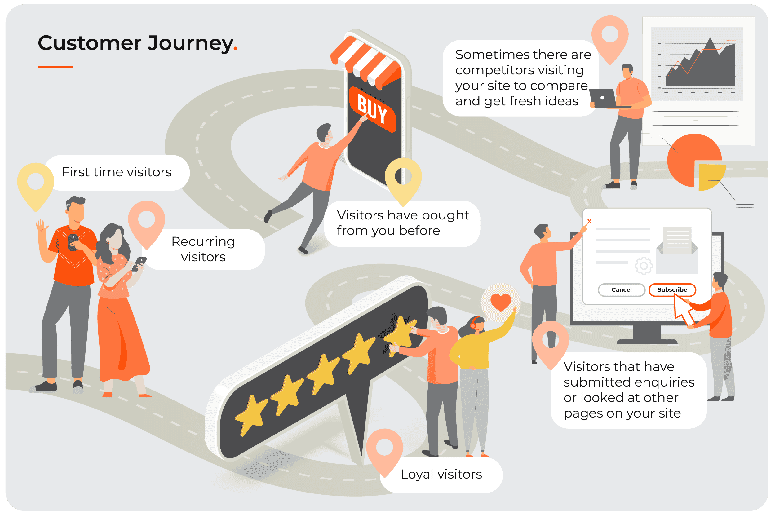
Remember that every visitor is unique in how they will browse your website and what their motivations are. Some are looking at you for the first time. Others have bought from you before. Some have submitted enquiries or looked at other pages on your site, and some have not. For these reasons, pop-ups can be annoying as they are forcing an interaction instead of allowing a customer to navigate there themselves.
If your customer is new to your website and brand, immediately triggering a feedback pop-up is not going to be relevant to them.
In the same way, a returning customer who has previously purchased should not see a pop-up for a deal exclusive to new customers.
Referring to the objective of your pop-up, keep asking, “will this benefit my customer at this point in their journey?”
You can then look to back up your assumptions by reviewing supporting data. Use your web analytics platform to review typical funnel flows and how many pages customers will view per session. Analyse heat mapping and session recording behaviours to validate typical page journeys and drop-off points. Perhaps you have existing customer feedback that you could use to inform how to speak to their needs?
These insights are to ensure your pop-up is personally relevant to your customer. Perhaps one of the most important rules of thumb to consider with this is that no visitor should ever see more than a single pop-up during their visit to your website. There may be opportunity to do so on a subsequent visit, ideally with something different to what they have seen before, but regardless of whether they have converted or not, multiple pop-ups in one session is a bad user experience.
Ensure you have set up the correct firing triggers to manage this and if you are running multiple pop-ups, they should be mutually exclusive, triggering to audiences that do not overlap.

5. Experiment, experiment, experiment
There is a lot to consider here, right? The reason why pop-ups should be part of your experimentation program is because you will not get it right first time, and you will need constant learnings to iterate and improve the experience.
To avoid negatively impacting user experience, running pop-ups through an A/B testing platform will allow you to test a subset of your total traffic against a control group. This way you can mitigate the risks whilst measuring not only conversion rates, but also impact to engagement metrics such as bounce and exit rate.
You should be testing everything; design, headlines, copy, call-to-actions through to types of triggers and audiences. If you have enough volume, you could use multivariate testing to validate a number of these variables at the same time.
Regardless of what you do, always have a control group, and always analyse a range of metrics and funnels to get a full picture of how your pop-ups are influencing your customers.
Every learning is important and can continue to shape and refine your strategy in delivering the best experience possible!
A final word
We hope we have explained clearly why pop-ups are still a powerful tool when they are used correctly. If you have read this far, we also hope you have gained some insight into when and when not to use them and the factors you ought to consider before deploying them.
However, all of this is still just the tip of the iceberg. We were not joking when we said that pop-ups could produce a 1,000% uplift in conversions, but those results are only possible with expert help.
Our team of CRO experts stand ready to guide you through your experimentation strategy, and they would love to hear from you.
Are you ready to improve your conversion rates through advanced experimentation strategies?


